NOURISH
Planning and ordering healthy meals
A Google UX Design Professional Certificate course project
A concept app
NOURISH is a hypothetical meal delivery service that provides both ready meals and DIY meal kits. NOURISH specializes in healthy meals and accommodates special diets and nutritional needs.
NOURISH targets busy, health-conscious professionals, who lack the time and attention to order healthy meals when at work.
The goal was to design the main user flow of the app for NOURISH that allows users to easily sign up for the meal-delivery service, do the meal-planning ahead of time, and receive tasty, healthy meals weekly.
Roles
Product Designer
UX Designer
UI Designer
Deliverables
Competitor’s audit
User interviews
User personas
User journeys
Storyboards
Task flow
Low- and high-fidelity prototypes
Usability studies and findings
Tools
Figma
Illustrator
Photoshop
Understanding the User
User Research
A user survey helped me sort out the potential users for our product. I then conducted one-on-one interviews and created empathy maps to understand the users I’m designing for and their needs. A primary user group identified through research was health-conscious, busy professionals who order take-out food on a regular basis.
The research revealed that our users often find it overwhelming to order food. They wish for a quicker and easier way to order tasty and healthy meals.
Persona and Problem Statement
Jean is a senior software developer who needs a faster, stress-free way to get access to tasty and healthy meals when at work, because ordering food takes too much time and requires too much attention.

User Journey Map
Mapping Jean’s current user journey revealed how stressful it was for her when ordering food at work and how we could help her by simplifying the decision-making process.
The user journey map helped us understand how much our users would benefit from a meal planning and delivery service that specializes in healthy meals.
Storyboard
The big-picture storyboard helped us understand how a healthy meal delivery app could potentially solve our user’s problems.


1. It’s late. Jean is still working at the office. She’s hungry.

2 She browses through her food ordering apps and feels overwhelmed by too many choices., complex customization options, and the long waiting time.

3. After finishing her food, she feels sluggish and regrets not having ordered healthier food instead.

4. Later on, when resting at home, she discovers our healthy meal delivery app and becomes interested.

4. She signs up for a week of meal delivery.

5. On the day of the scheduled delivery, she receives a box with meals inside that can be enjoyed after heat-up.

6. Now she can always eat on time and feel good afterward. She decides to stay subscribed.
Starting the Design
Paper Wireframes

Taking the time to draft possible versions of each screen of the app on paper ensured that the findings from the research were addressed in the design and that the key tasks were kept simple. I prioritized a linear user flow to help users save time.
Low-Fidelity Prototype

After sketching, I translated the digital wireframes into a low-fidelity prototype which was later used in the initial usability study.
Easy customization was a key user need to address in the designs. I provided users with two ways of customizing: 1. To pick a dietary preference; 2. To find out which dietary preference to pick through a quiz. In order to simplify the decision-making process, users can fill their boxes based on their dietary preferences.
View the NOURISH low-fidelity prototype
Usability Studies
I conducted two rounds of guided usability studies. Findings from the first study helped guide the designs from digital wireframes to mockups. The second study used a high-fidelity prototype and revealed what aspects of the mockups needed refining.
Both studies showed that stress-free meal customization is the major challenge in the design of this app.
Study I findings:
Users needed more information prior to customization
Users were still overwhelmed by the customization process
Users were confused when picking meals
Study II findings:
Users still felt uncertain during the customization process
Users were confused by the prices and box sizes when customizing
Users did not find the filtering button
Refining the design
Iterations
Based on the findings through the usability studies, I made two rounds of iterations. Major changes in the user flow were made after the first usability study in order to meet the range of user needs. The UI and flow were optimized after the second usability study to provide a smoother experience.
Iteration process example A

Early designs led users straight to the sign-up process after a brief introduction to the service. After the first usability study, I added a bottom navigation bar that leads to the Menu, Saved (meals), and Q&A. This way the users can make an informed decision before signing up.
Iteration process example B

Early designs required users to choose their dietary preferences. They would receive advice through a quiz, where they needed to input their personal information. After the first usability study, users now had the option to completely skip the customization process.
Customized illustrations
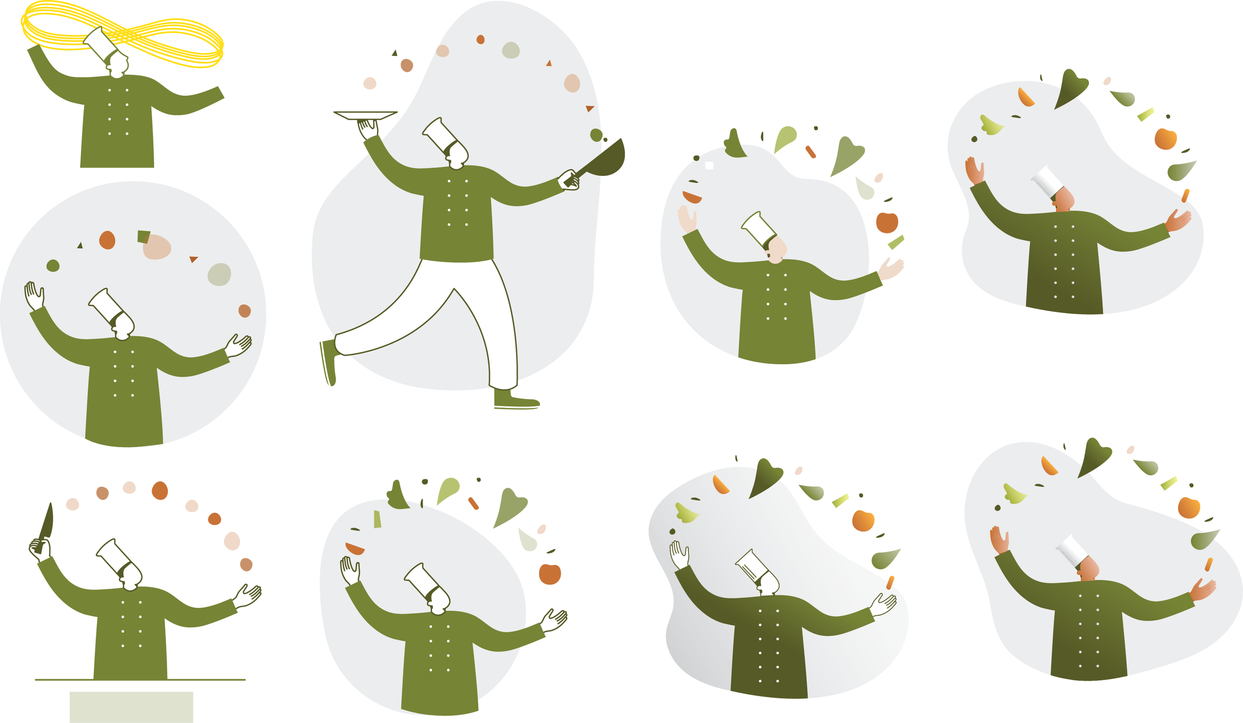
As the illustration works will make the first visual impression of the app, it is crucial to customize those in order to cohere with the brand identity of NOURISH.
High-fidelity prototype
The final high-fidelity prototype presented a more flexible user flow for signing up. It met both the needs of users who’d like to spend as little effort in the signing-up process as possible and users who’d like to make an informed decision when signing up.
View the NOURISH high-fidelity prototype
Accessibility consideration
1. Used high-contrast colors by WCAG standards
2. Used icons to help make navigation easier
3. Considered readability when designing fonts
Going forward
Takeaways
While designing the NOURISH app, I learned that it’s important to conduct user research at each stage of the design. This way we could avoid designers’ personal biases and save time overall.
In the beginning, I was overwhelmed by the idea of designing something that I myself would not need. However, it turned out to be an amazing experience to understand users and find out what makes the tick.
Next Steps
Conduct another round of usability studies to validate whether the pain points users experienced have been effectively addressed.
Design a complete app experience, including sign-in, delivery, package recycling, etc.
Fine-tune the UI design
Make the design more accessible by testing it using assistive technologies.